Eternal Wreckening: Mobile Horror Game

Eternal Wreckening: mobile horror game cover

A mobile horror game with intuitive controls, immersive visuals, and full-body movement mechanics, set in a chilling dystopian world.

Game Design Interaction Design UI Design Figma 2024
Role Solo Designer
Timeline 8 weeks · 2024
Tools Figma · Illustrator · Procreate
Methods Game Design · Storyboarding · Interaction Design
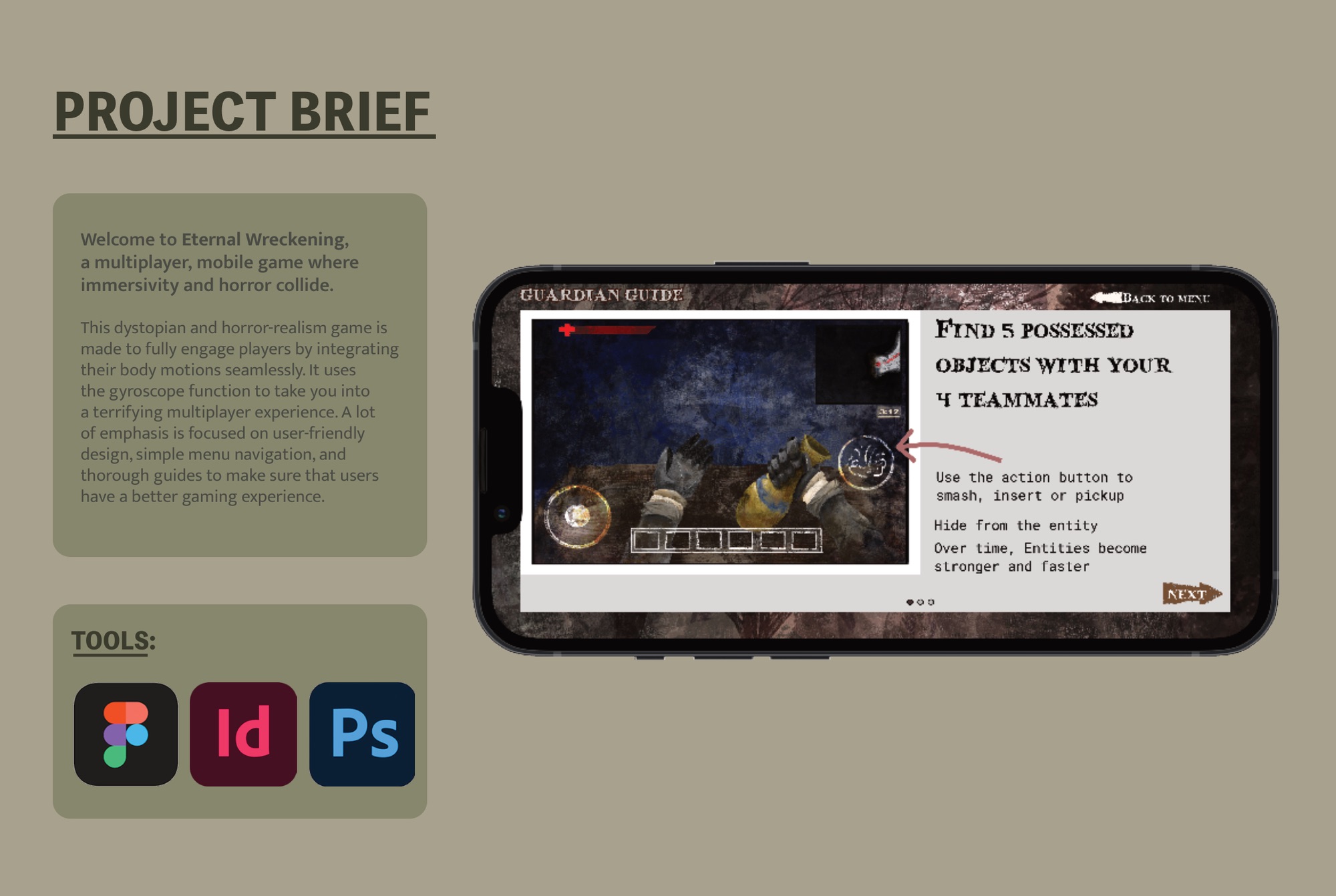
Eternal Wreckening project brief: a multiplayer mobile horror game where immersivity and horror collide

The design brief: immersivity and horror, on a phone

01

Mobile games forget you have a body.

Standard mobile controls hand you two thumbs: left thumb moves, right thumb aims. Your torso, your hands, the instinct to flinch all wait outside the screen. For most genres that tradeoff works fine.

Horror is the exception. It runs on presence, on the sense that you're in the space and the threat is sharing the room. Keep the player's body outside the experience and you can still build atmosphere, but you can't manufacture dread. The screen stays a window when it needs to be a portal.

Horror falls apart at arm's length. The threat has to feel like it's in the room, which means putting the player's body in the game, not just on the screen.
Design intent, Eternal Wreckening
01 Body as controller. Gyroscope, shake, tap, and vibration replace passive thumb controls with full physical engagement.
02 Horror through presence. The player's body inside the experience amplifies tension that visuals alone can't create.
03 Interface that moves with you. Controls and feedback respond to physical input, not just touch coordinates.
04 New mechanics, no friction. Three unfamiliar input methods taught through play, not instruction screens.
02

Three layers of physical play.

I built the controls around a hierarchy of physical engagement, large to small. Each layer pulls in the body at a different scale: full-body orientation, then muscle fatigue, then haptic pulse in the fingertips.

Large
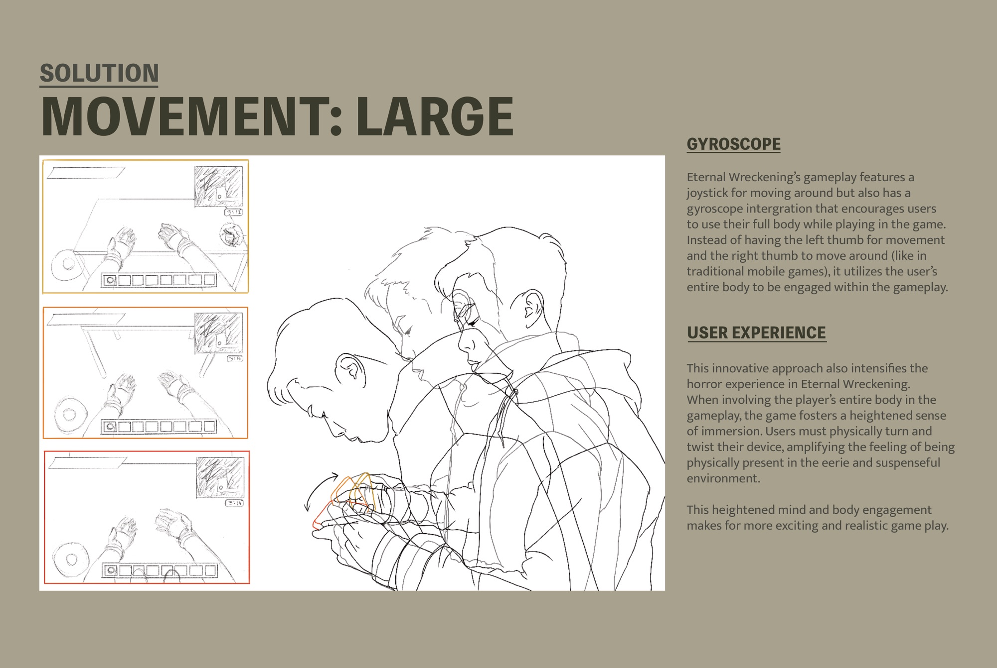
Gyroscope. Instead of the right thumb sweeping the camera (the mobile default), you turn and tilt the device to orient within the world. The joystick on the lower left handles movement; the body handles perspective. You lean around corners and face threats head-on, so the horror environment turns into a place you inhabit rather than watch.
Medium
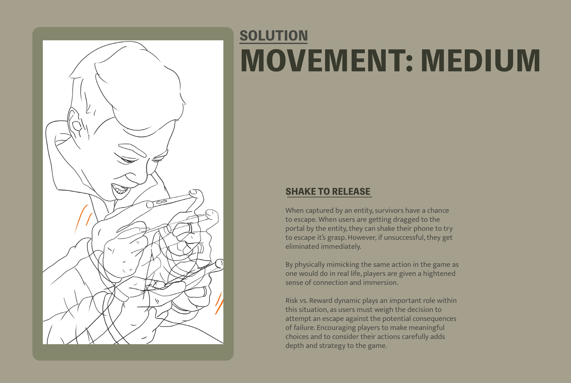
Shake to escape. When the Entity grabs you, you shake the phone to break free instead of tapping a button. The motion mirrors what you'd do if something actually grabbed you, which makes the panic land in your hands. It carries a cost: a failed shake eliminates you on the spot, so you're forced into a real decision under pressure.
Small
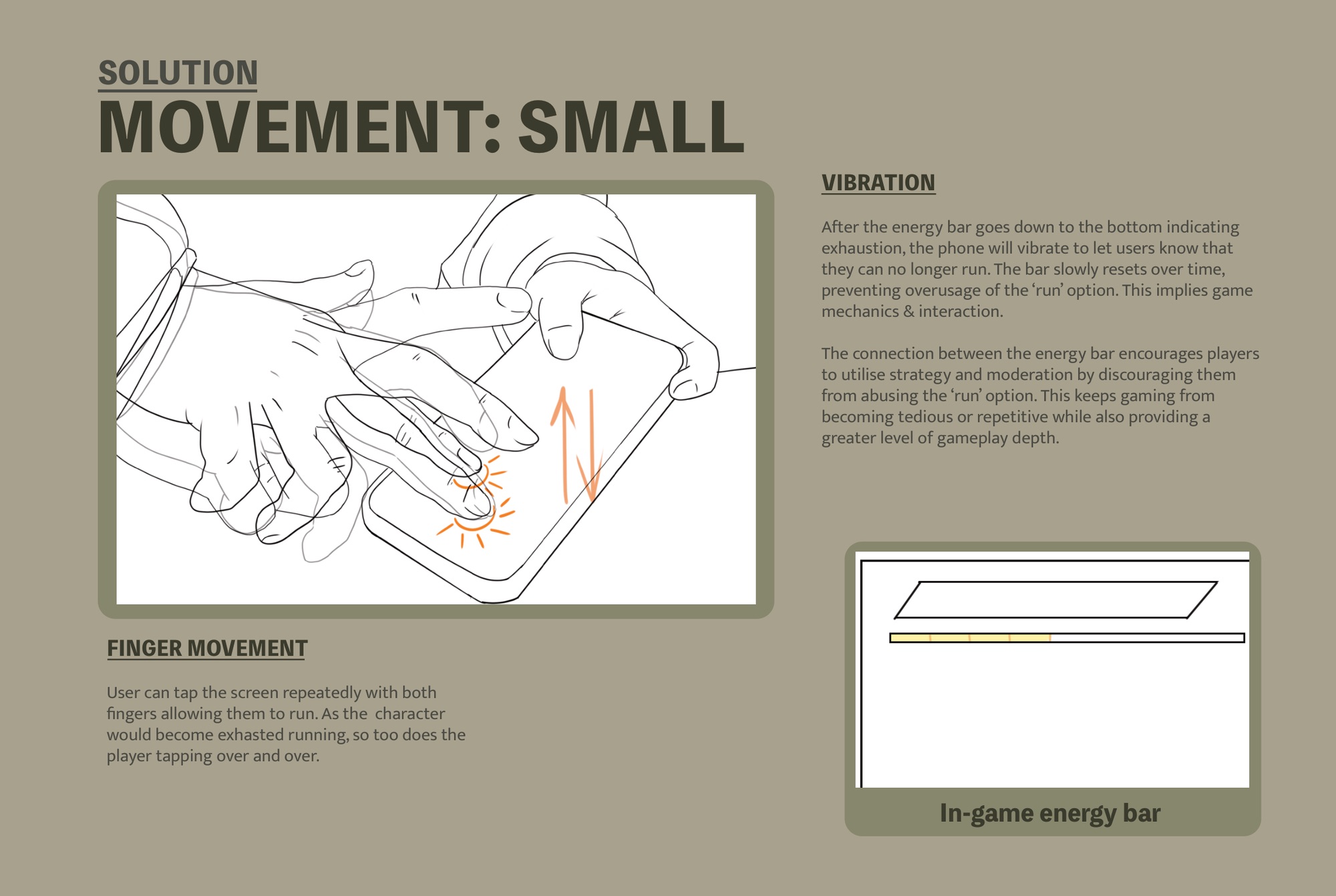
Tap to run, vibrate to stop. Sprinting means both thumbs tapping the screen as fast as you can. As the energy bar drains, the phone vibrates: your character is winded, and by then so are your fingers. When the bar refills you can run again. You feel the cost of the resource instead of just watching the bar slide down.
Gyroscope mechanic — full body movement replaces right-thumb camera control
Large: Gyroscope. Full-body orientation replaces the right thumb. Players turn, tilt, and lean their way through the horror environment.
Shake to escape mechanic — physical mimicry creates visceral connection, risk vs reward
Medium: Shake to escape. Caught by the Entity, you shake to break free, and a failed attempt eliminates you. Physical mimicry meets risk-vs-reward.
Vibration and tap mechanics — energy bar depletes as fingers tire, phone vibrates at exhaustion
Small: Tap to run, vibrate to stop. The energy bar and the player's fingers exhaust together. Haptic feedback closes the loop between body and screen.
03

Four hunters, one monster, earned map.

Eternal Wreckening is a 4v1 asymmetric multiplayer game inspired by Dead by Daylight, the survival horror game that defined the predator-versus-survivors model. Bringing that to mobile meant rethinking how the structure feels when the controller is your whole body. Four Guardians have to find and destroy five Abyssal Amulets scattered across the map, release the gem fragment from each, and throw them into the portal to close it and eliminate the Entity. One player controls the Entity and tries to knock down all four Guardians and throw them into the portal before it closes.

The asymmetry is structural. Guardians, represented by Harper Stone, start with full visibility but face an unknown map and limited tactical tools. The Entity, played as Sorcha Nightshade, starts 30 seconds later with reduced visibility but gains a new ability every three minutes: speed multipliers, enhanced detection, extended capture range. The longer the match runs, the more dangerous Sorcha becomes. The clock works for the monster.
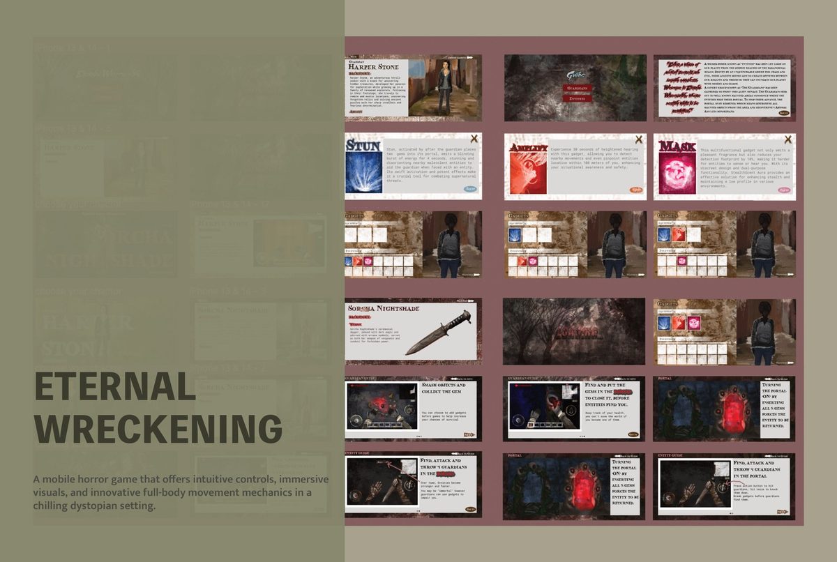
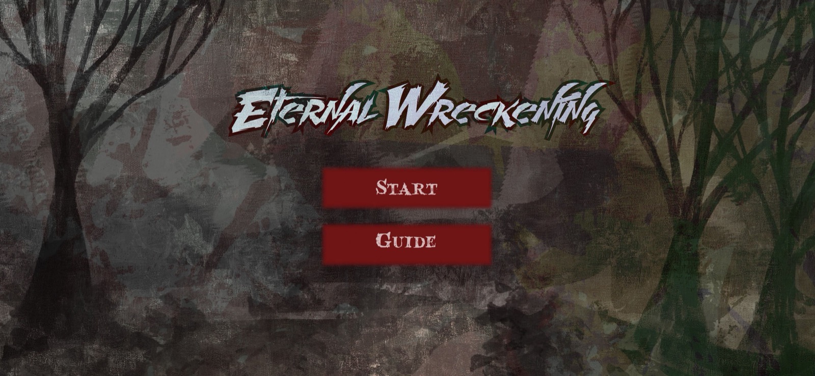
Main menu: Start and Guide buttons over a dark forest background

01 · Main menu

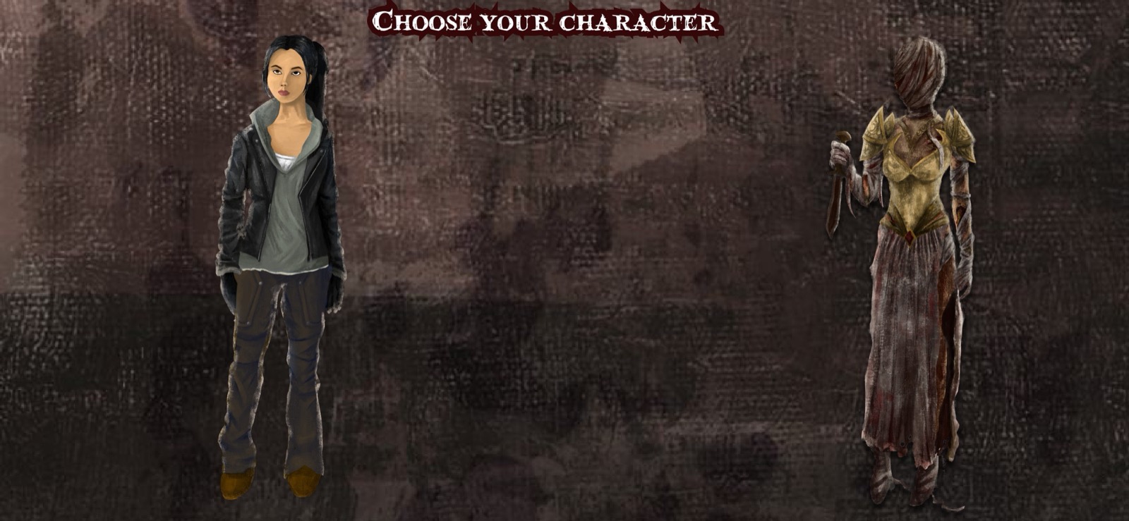
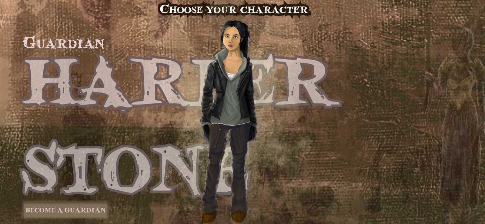
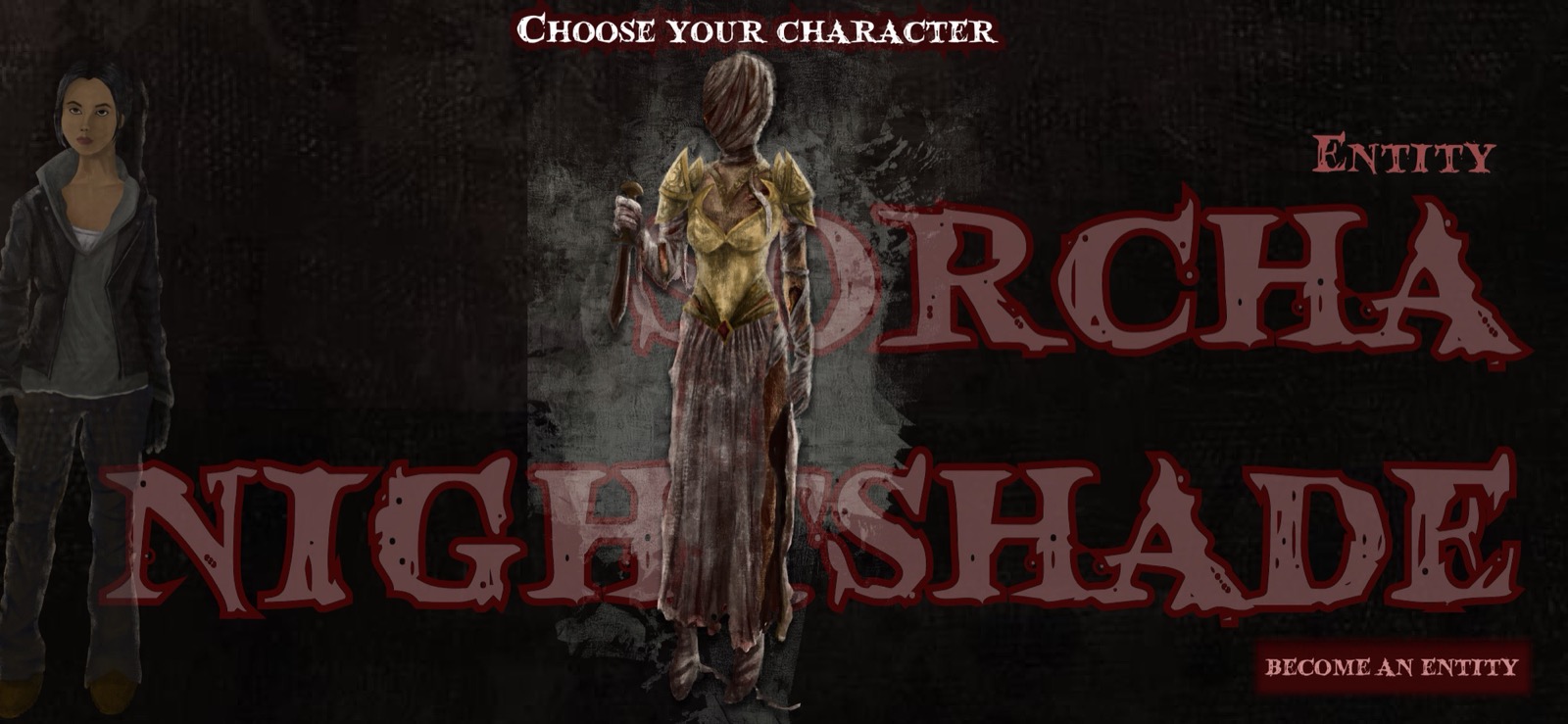
Choose your character: Harper Stone and Sorcha Nightshade face each other

02 · Choose role

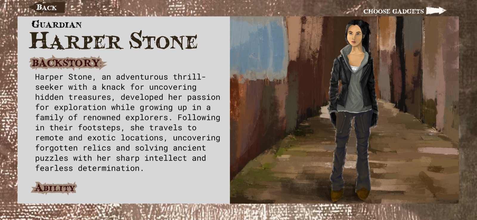
Harper Stone Guardian backstory: adventurous thrill-seeker, family of renowned explorers

03 · Guardian backstory

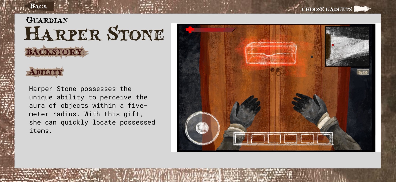
Harper Stone ability: perceive aura of objects within five-meter radius

04 · Guardian ability

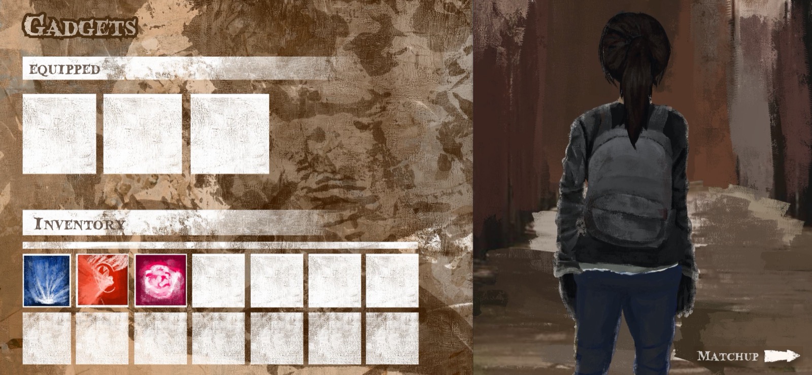
Gadget selection screen: empty equipped slots, three gadgets in inventory

05 · Gadget loadout

Gadget selection: three gadgets fully equipped, ready for match

06 · Loadout ready

Loading screen: dark atmospheric forest with LOADING text

07 · Match loading

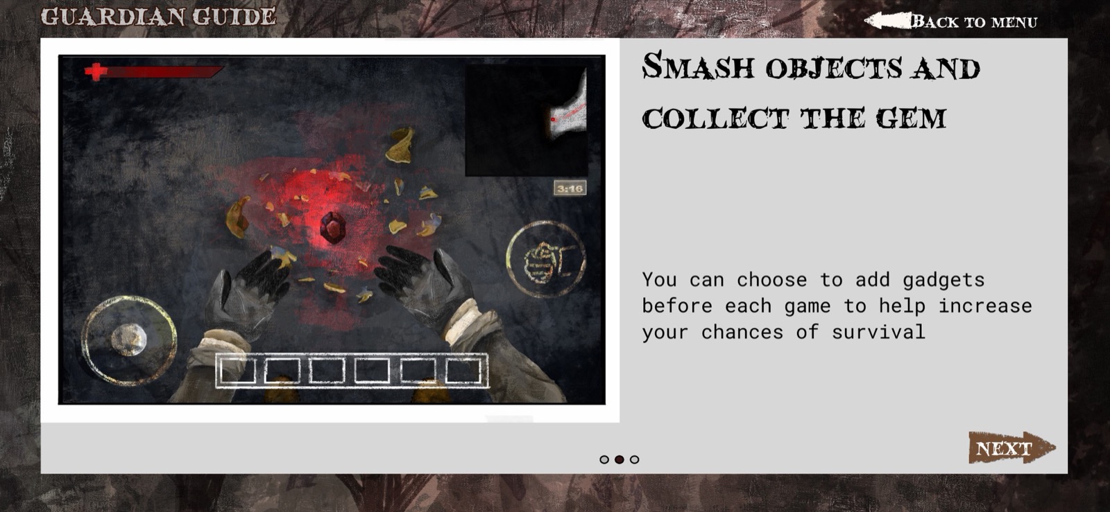
Guardian Guide step 2: smash objects and collect the gem

08 · Smash amulets

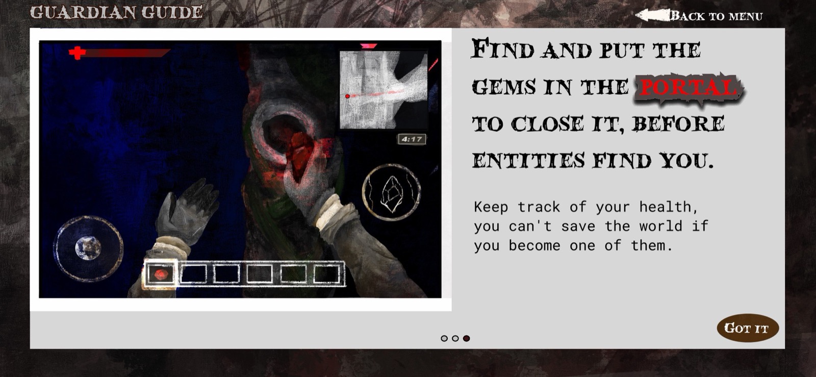
Guardian Guide step 3: find and put gems in portal to close it

09 · Close the portal

Drag to explore the game flow →

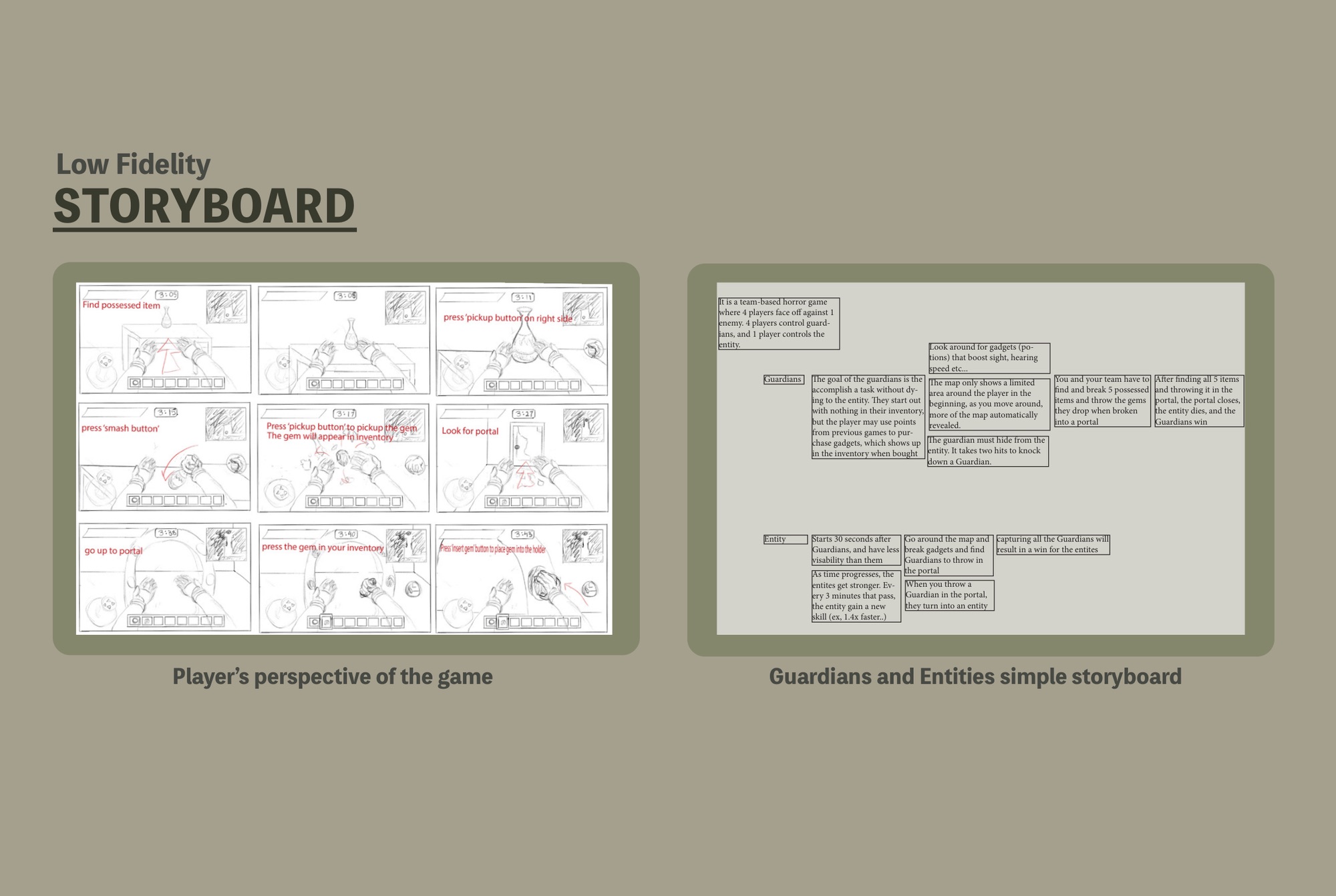
Low-fidelity storyboard: Guardian and Entity game loops, map reveal mechanic, portal goal

Fig. 01: Low-fidelity storyboard: Guardian and Entity loops, from spawn to portal

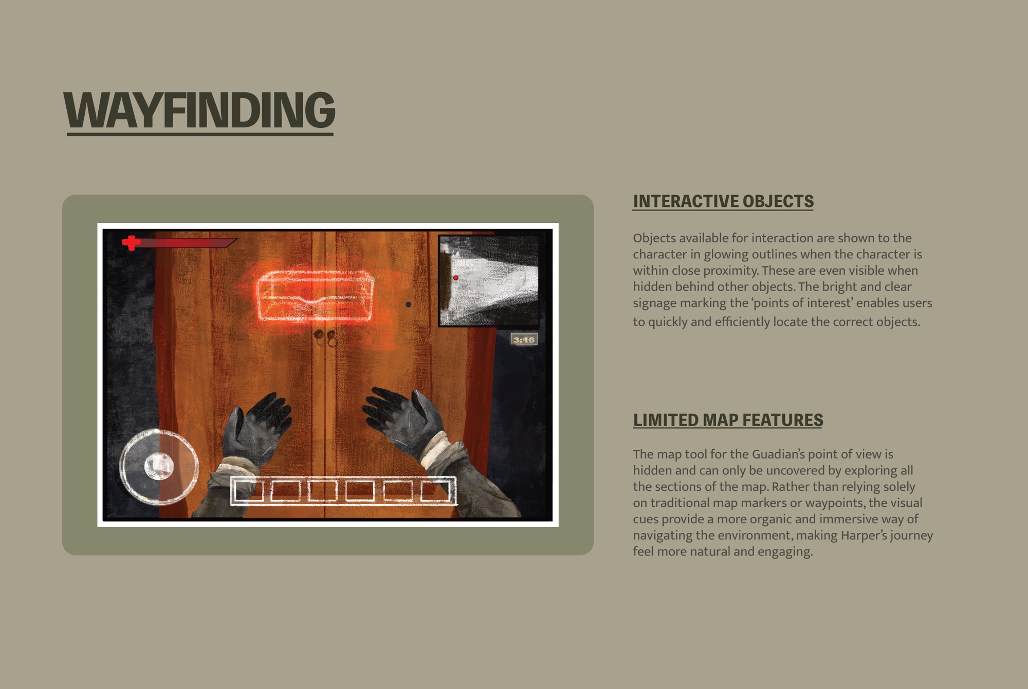
Map wayfinding is intentionally constrained. The fog-of-war map only shows areas the Guardian has physically walked. There's no overhead view to fall back on; you earn the map by moving, which pits exploration against self-preservation. You can hide or you can scout, not both at once.

Interactive objects glow when your character gets close, even through walls. In an otherwise dim, disorienting environment, those bright outlines are the one signal you can trust, and they pull you toward the light.

Wayfinding: glowing interactive objects visible through walls, fog-of-war map reveals by exploration

Fig. 02: Wayfinding: glowing objects cut through fog, and the map only opens what you've walked

4v1
Asymmetric team structure. Four Guardians work to close the portal; one Entity works to stop them. Each side has distinct abilities, visibility ranges, and win conditions.
5
Abyssal Amulets scattered across the map. Guardians must find all five, break each to release a gem fragment, and throw every gem into the portal before the Entity eliminates them.
30s
Head start for the Guardians. The Entity spawns 30 seconds after they begin, leaving a short window to orient before the hunt opens. The Entity starts stronger, then keeps gaining power.
3 min
Power escalation interval. Every three minutes, the Entity gains a new ability: speed multipliers, enhanced detection, extended capture range. Drag the match out and the monster wins.
Choose your character screen: Harper Stone (Guardian) and Sorcha Nightshade (Entity) face each other

Fig. 03: Role selection: choose Guardian or Entity before the match begins

Harper Stone Guardian character select screen with backstory and gadget loadout entry
Harper Stone, Guardian. Adventurous thrill-seeker from a family of renowned explorers, with the ability to perceive the aura of possessed objects within a five-meter radius. Before entering a match, Guardians choose their gadget loadout, building a pre-match strategy around the tools they bring in.
Sorcha Nightshade Entity character select screen with predator role overview
Sorcha Nightshade, Entity. Exiled wielder of forest magic, armed with a ceremonial dagger and dark arcane force. A solo predator growing stronger every three minutes, she hunts all four Guardians and needs to eliminate them before the portal closes.

Fig. 04: Character select: Guardian and Entity archetypes carry distinct visual languages and ability sets

04

Horror that reads.

The visual language had to carry atmosphere and stay legible at the same time. Horror aesthetics lean on obscurity; game UI demands that you read it instantly. I split the registers to settle the conflict: the environment carries mood, the interface carries function, and color stitches them together.

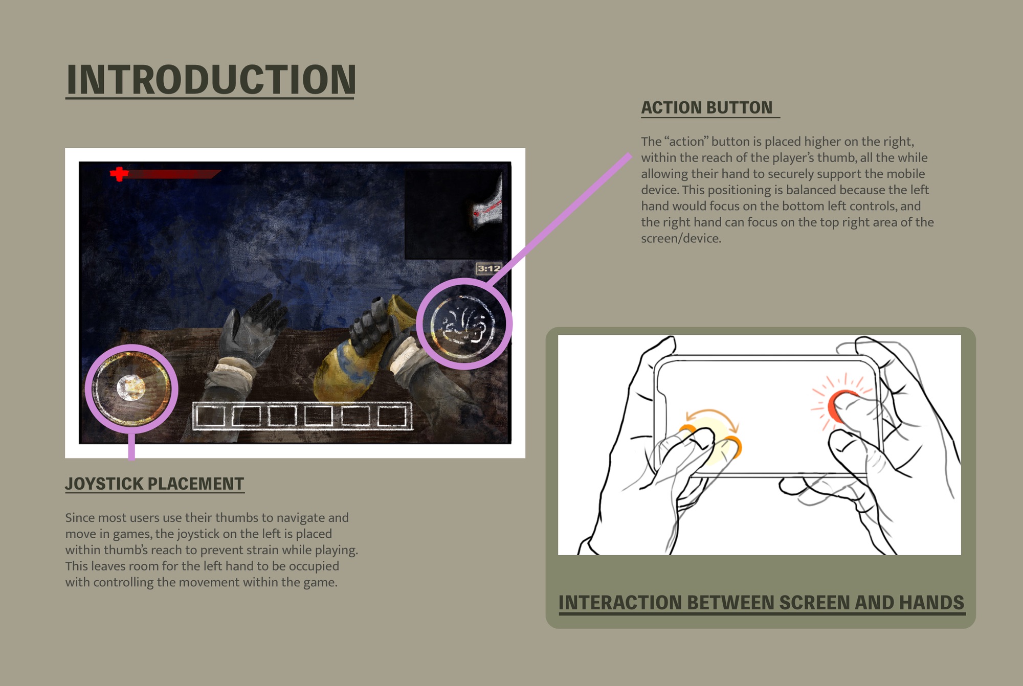
Control layout: joystick bottom-left for movement, action button top-right for thumb reach
Controls ergonomics. Joystick sits bottom-left (left thumb movement). Action button sits top-right (right thumb reach). Each hand has a distinct zone, preventing grip interference during intense play.
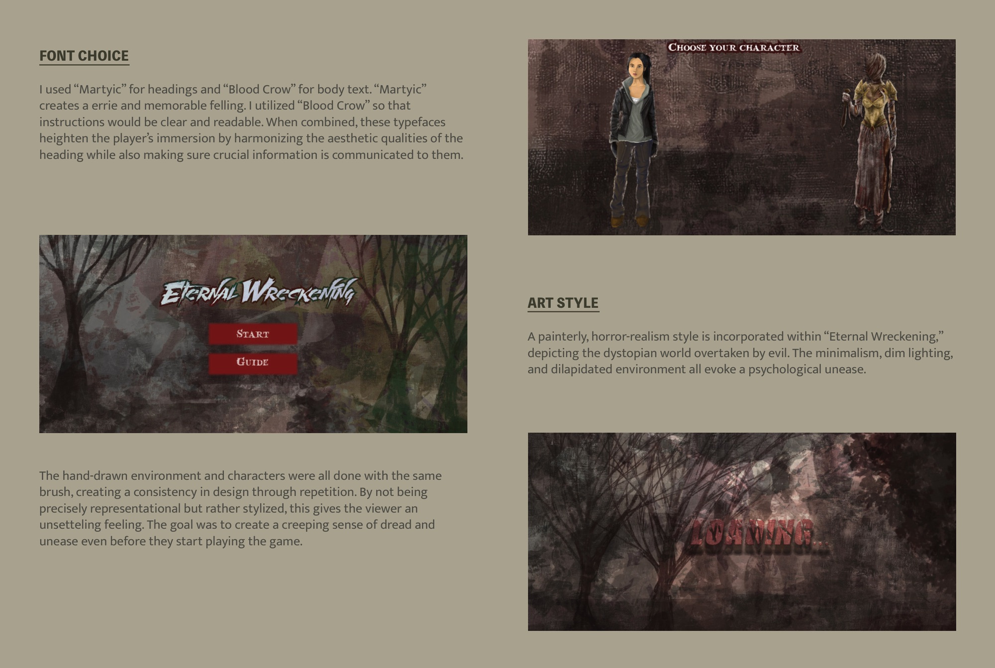
Typography: Martyric headings for atmosphere, Blood Crow body for legibility
Typography. Martyric carries the eerie heading register. Blood Crow handles body copy: legible under pressure, with enough texture to stay in-world, so instructions read clearly while the dread holds.

Art direction: painterly horror-realism. I hand-drew every environment and character with the same brush, so the repeated stroke holds the look together. The style stays stylized rather than literal, because stylized forms unsettle in a way photorealism rarely manages. I wanted dread to creep in before the first interaction, a world that looks familiar but reads slightly wrong.

Dim lighting, decaying geometry, and a brown-dominant palette ground the game in a dystopian world that's already rotting. The low contrast works against you: spotting a threat takes real attention. Whatever brightness the palette does carry has one job, which is to mark what matters.

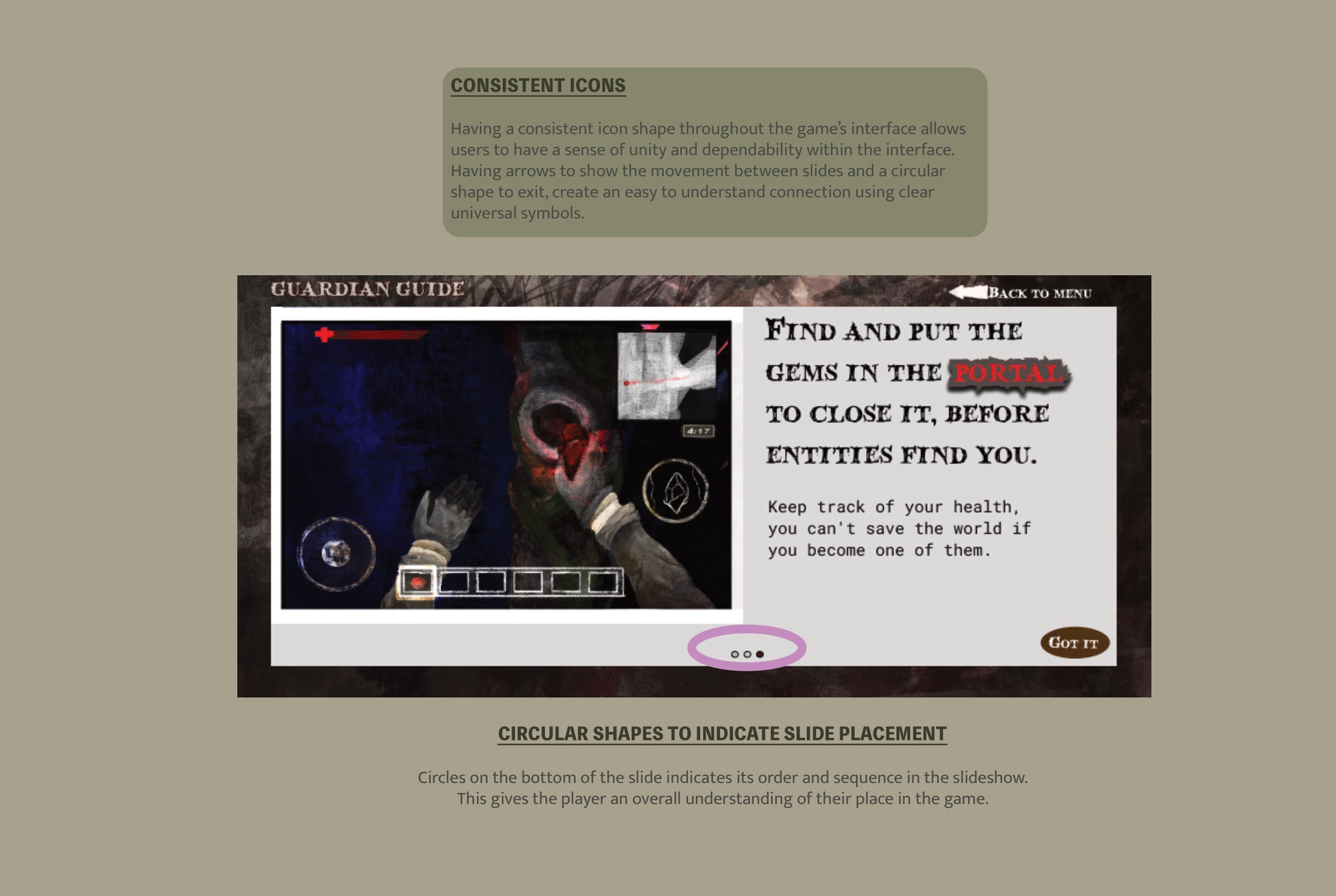
Icon system: consistent circular shapes, arrow for direction, circles for slide position indicators

Fig. 05: Icon system: circular shapes, universal symbols, consistent shape language throughout

Icon system. Every interactive icon shares a circular base, and the repetition teaches one rule: round means you can touch it. Arrows signal direction. A drawn circle stands in for an "exit" text label, so the control stays in harmony with the illustrated art and the interface reads as authored, not pulled from a kit.

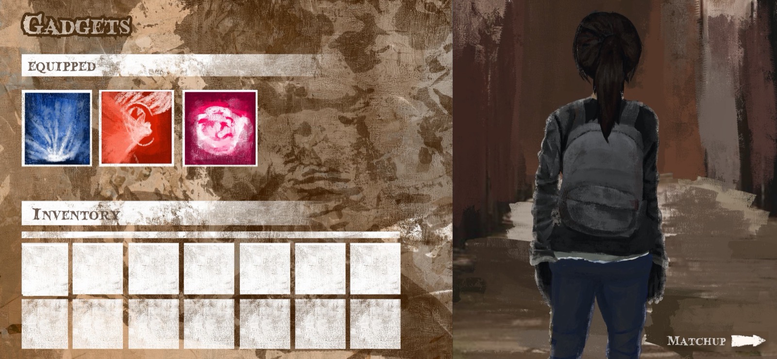
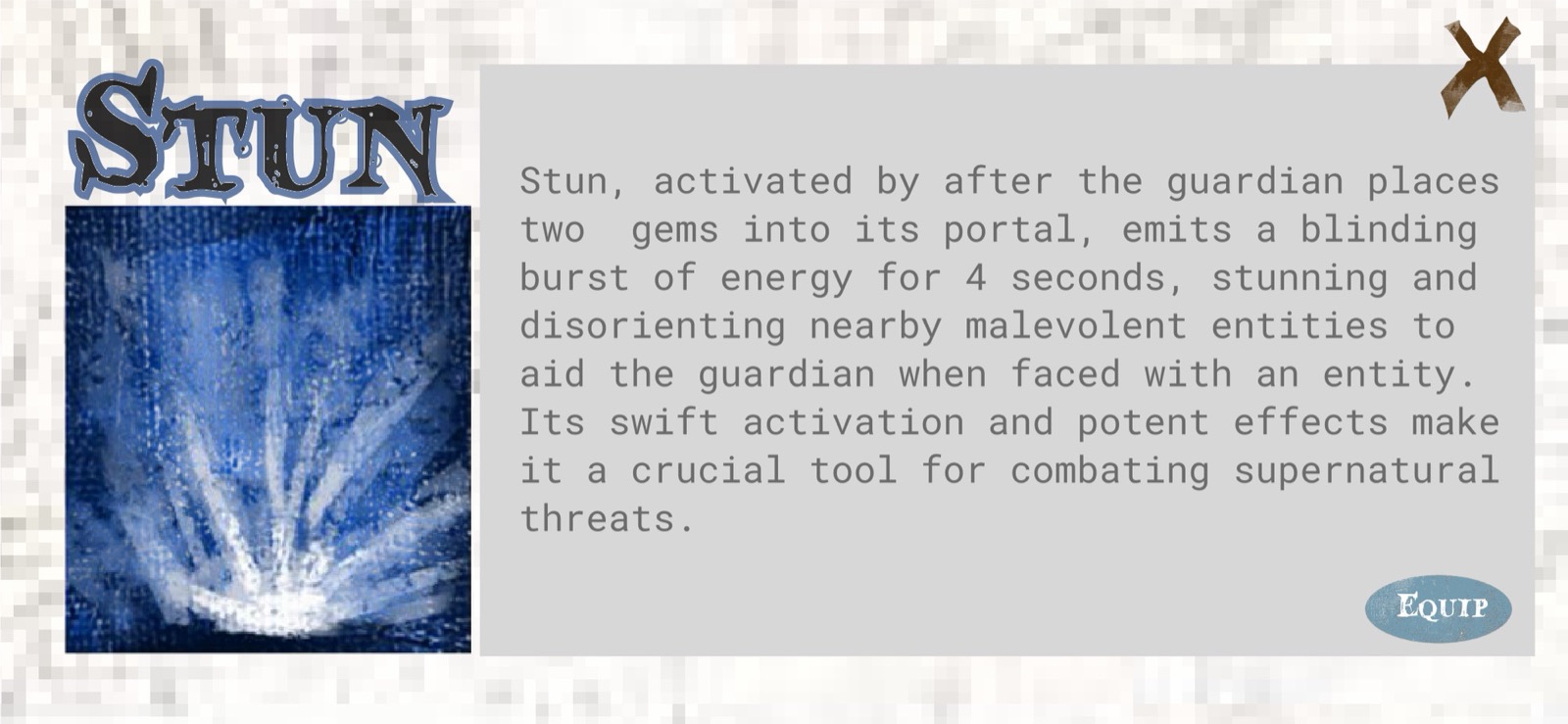
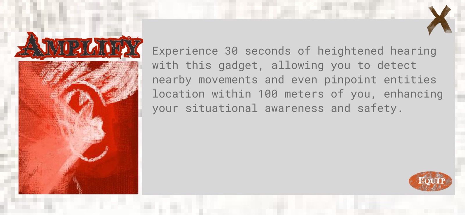
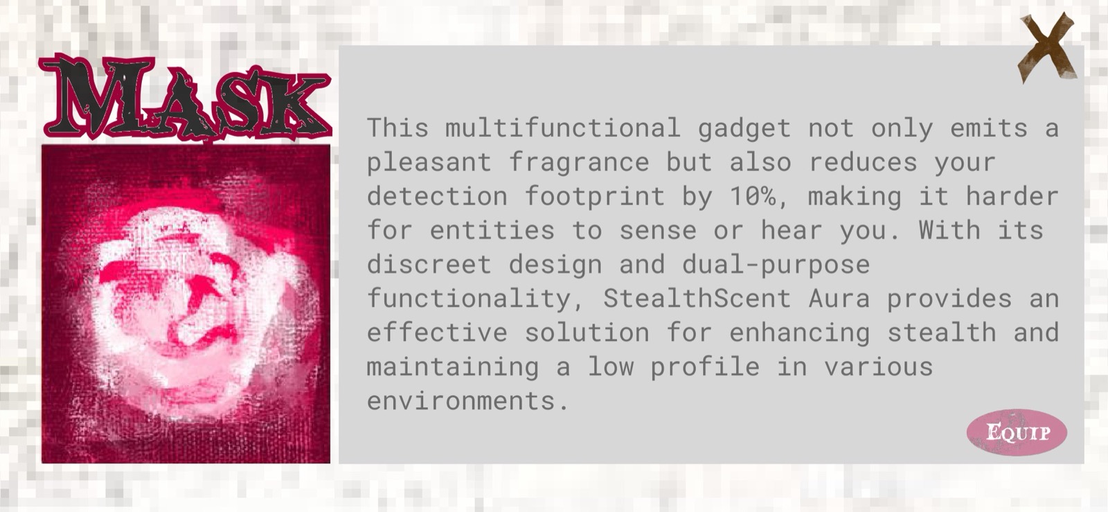
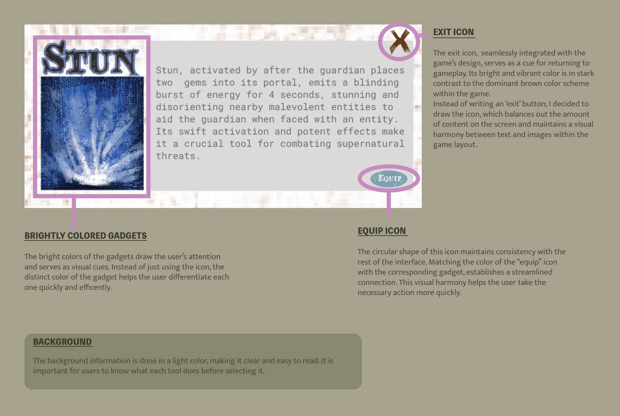
Gadget selection. Before each match, Guardians pick from three tactical items that shape how they play. Stun fires a blinding burst for four seconds, available once two gems are placed. Amplify sharpens hearing for 30 seconds and surfaces the Entity within 100 meters. Mask cuts detection range by 10 percent for a stealthier run. Each screen leans on bold color coding so you can size up and compare options at a glance while the pre-match clock runs.

Stun gadget selection screen: blinding burst 4 seconds, activated after 2 gems placed
Stun. Blinding burst for 4 seconds. Activates after inserting 2 gems into the portal. Offensive counter against a pursuing Entity.
Amplify gadget selection screen: 30 seconds heightened hearing, detects Entity within 100m
Amplify. 30 seconds of heightened hearing. Detects the Entity anywhere within 100 meters. Coordination tool for the whole team.
Mask gadget selection screen: reduces Entity detection range by 10%, stealth passive
Mask. Reduces detection range by 10%. A passive stealth modifier for players who move quietly and avoid confrontation.

Fig. 06: Gadget selection: three tactical items, each color-coded and function-distinct

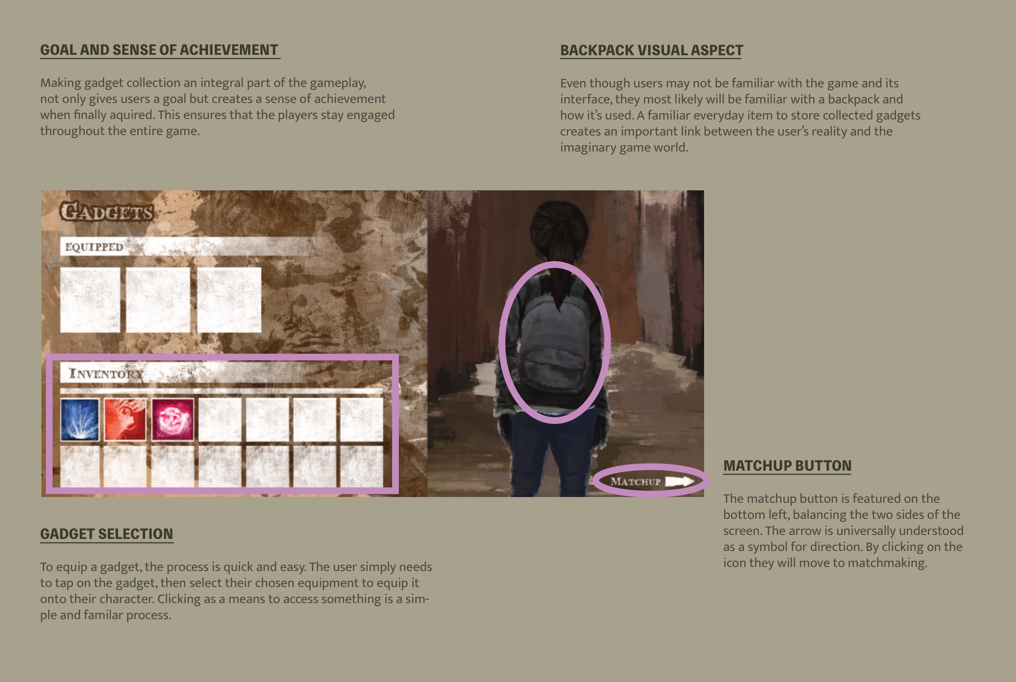
Inventory and backpack UI. Collected gadgets live in a backpack, a real-world object players already understand. The equip icon takes on the color of the selected gadget, so item and action stay visually linked. In a dim, high-stress moment, that color tells you what a label would have, faster.

Gadget collection UI: backpack metaphor, matchup button, gadget selection flow
Backpack and gadget UI. The inventory uses a backpack, an object players already know how to read. Collecting gadgets adds a second goal on top of survival: gather as you go. You tap to select and tap to equip, so familiar interactions carry an unfamiliar world.
Color system for gadgets: bright colors for quick differentiation, equip icon color matches gadget
Color as wayfinding. Bright gadgets pop against the brown palette and grab the eye right away. The equip icon matches the selected gadget's color, tying item to action. When the screen is dim and the pressure is on, that color does what a label can't do fast enough.

Fig. 07: Inventory and gadget UI: familiar metaphor, color-coded affordances

Role-split onboarding. Three unfamiliar input methods need explaining before the first match. Instead of one tutorial screen, the game gives separate Guardian and Entity guides, each covering only the controls for that role. A Guardian doesn't need to learn how Sorcha moves, and the Entity guide gets to lean into the predator fantasy from the first screen. Splitting the paths keeps each side focused and protects the asymmetric mystery: you don't see the other side's mechanics until you've committed to a role.

Guardian Guide tutorial screen: role explanation, objective, and control instructions
Guardian Guide, step 2. Smash each Abyssal Amulet to release its gem fragment, then insert all five into the portal before the Entity eliminates the team. Gadgets can be equipped before each match to improve survival odds.
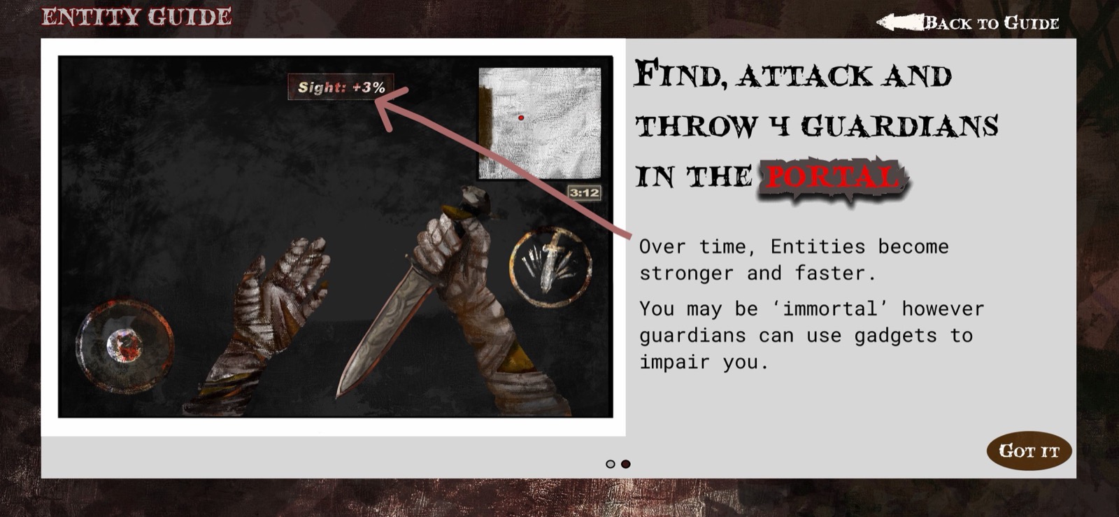
Entity Guide: find, attack, and throw all 4 Guardians into the portal to win; entities grow stronger over time
Entity Guide. Knock down each Guardian, then throw them into the portal. Entities are immortal: Guardians can only impair them with gadgets, not eliminate them. The Entity grows stronger and faster every three minutes.

Fig. 08: Role-split guides: Guardian and Entity each get their own learning path, preserving asymmetric mystery

05

What I'd build next.

Physical mechanics need physical playtesting.

I reasoned the gyroscope and shake mechanics through on paper but never stress-tested them in live play. A shake under threat feels nothing like a shake while you're calm. The depletion rate of the energy bar, the shake threshold to escape, the vibration pattern at exhaustion: each one needs hands-on tuning that static prototyping can't fake, because the body itself is the test environment.

Onboarding new controls without breaking the horror.

Teaching three unfamiliar inputs (gyroscope, shake, tap-to-run) inside a horror context is a tension I didn't fully crack. A standard tutorial screen punctures the atmosphere. I think the answer is contextual first use: a low-stakes scripted encounter that teaches each mechanic through play rather than instruction text. That's the version I'd build next.

The Entity is harder to design than the Guardian.

Most of my visual and interaction work sat with the Guardian's view. The Entity's UI deserves its own pass: a different field of view, different HUD priorities, a different emotional register. Whoever controls the monster should feel like the most dangerous thing in the room, and getting there takes a design language I haven't built yet.

Related project

Driftwood

Driftwood is a narrative game where the rules themselves become the emotional mechanic. Like this one, it works the seam between game design and human psychology.