UX Design · 2023
SoundCloud
App Critique
A critique of three areas in the SoundCloud iOS app (the 2023 logo rebrand, in-app widget customization, and playlist cover hierarchy) with a proposed redesign for each.
I audited the app experience, identified hierarchy and brand issues, and proposed targeted interface redesigns.
I compared SoundCloud's current UI against user expectations around recognition, customization, and playlist ownership.
The critique turns broad preference into design moves: restore brand memory, reduce repeat actions, and raise user-created art.
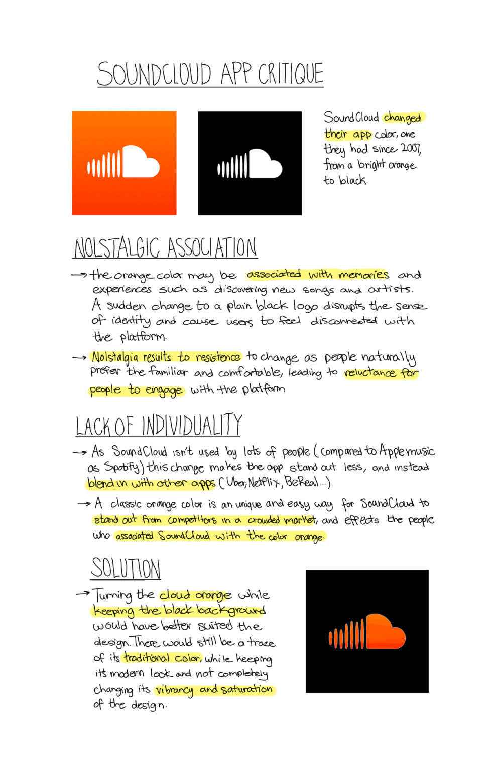
SoundCloud dropped the orange it had carried since 2007 for a plain black logo, breaking the nostalgic association users had with it and blending into every other app. The proposal: an orange cloud on the black background, keeping the traditional color inside the modern look.
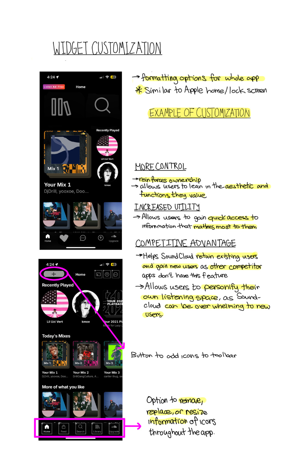
Formatting options for the whole app, similar to customizing an iPhone home screen: add, remove, replace, or resize the icons in the toolbar. Competitor apps don't offer this, so it doubles as a retention edge while giving users ownership of their listening space.
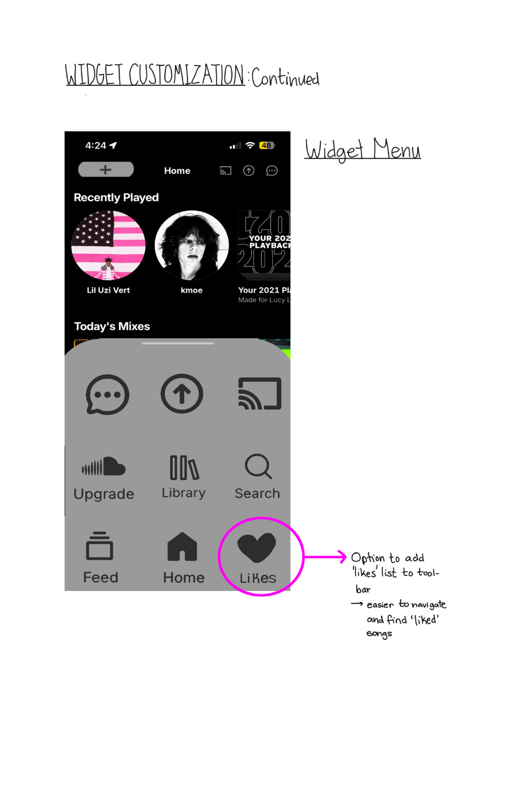
A redesigned widget menu and a dedicated likes toolbar cut the steps between you and the tracks you come back to most.
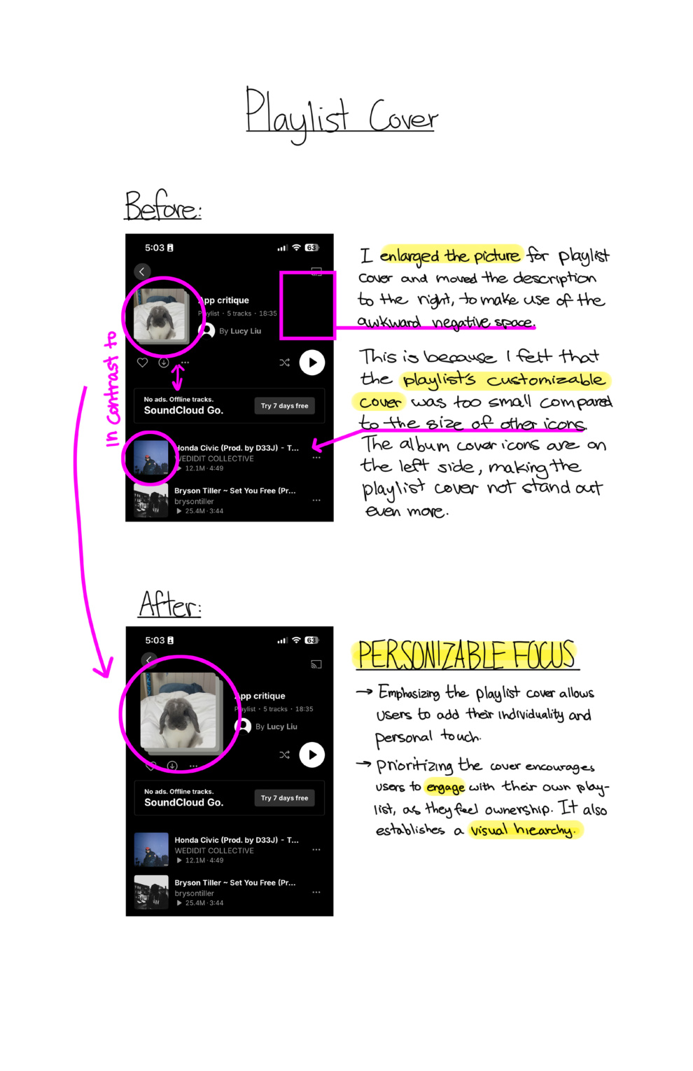
The customizable playlist cover renders too small against the surrounding icons, so personal curation gets visually buried. Enlarging the cover and moving the description into the dead space beside it puts the user's own art at the top of the hierarchy.