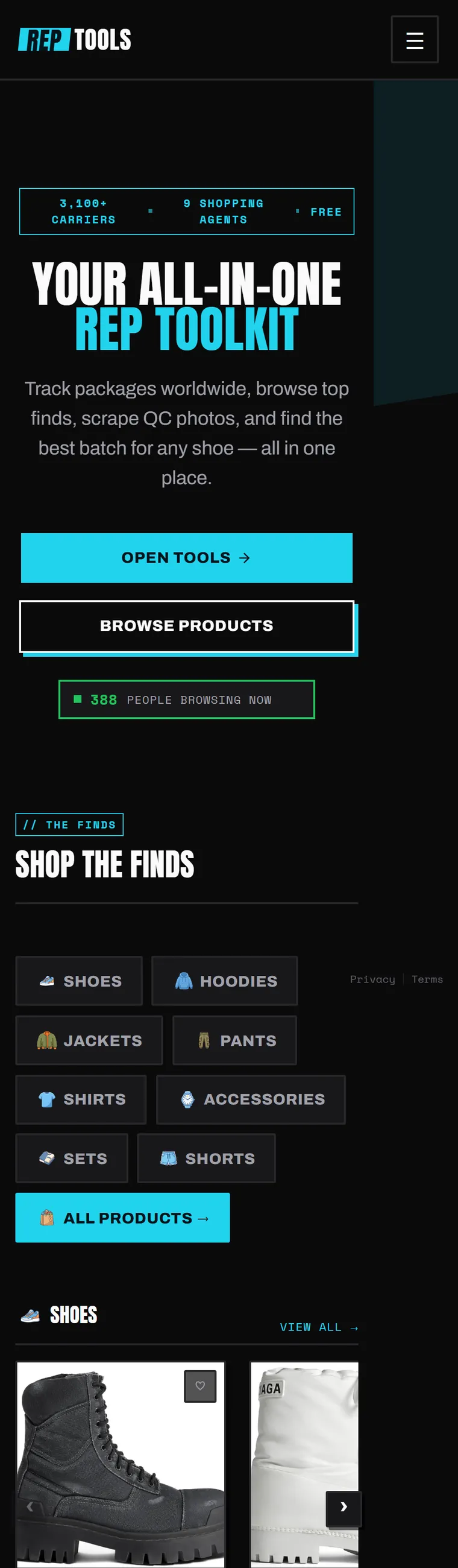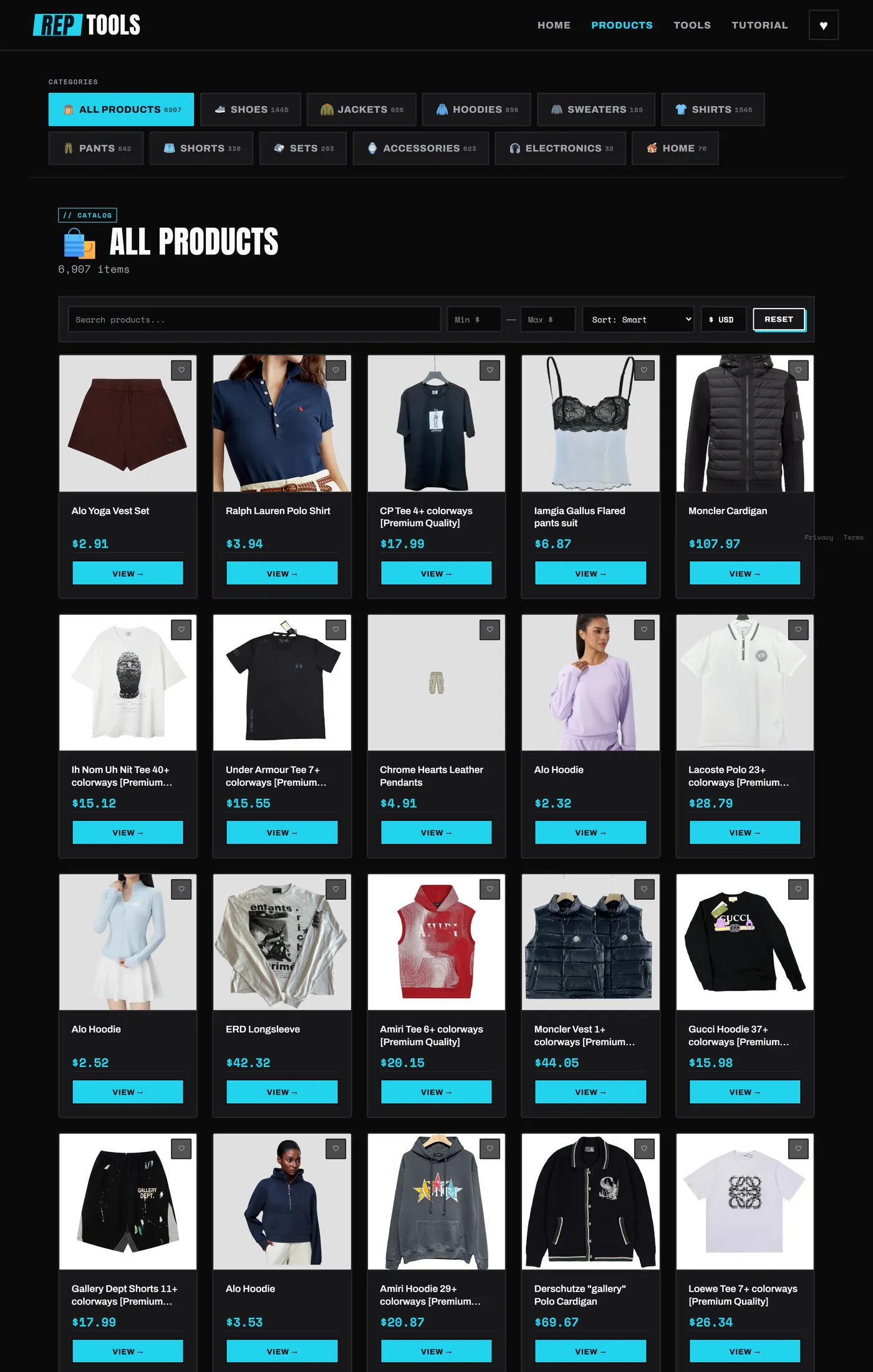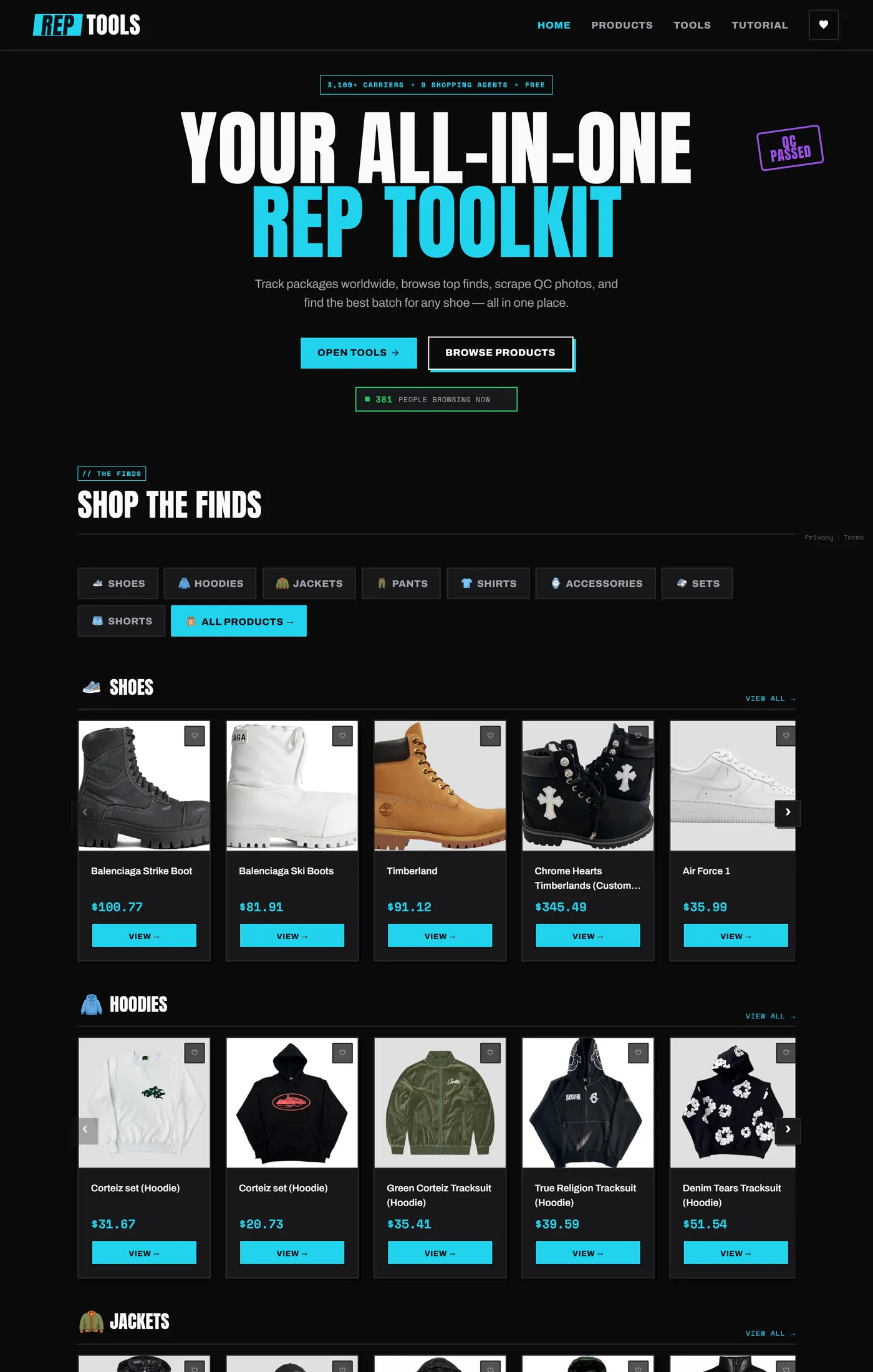
rep.tools homepage after the redesign: oversized condensed headline and a browsable product catalogue

rep.tools

Brand & UX  ·  Redesign

A toolkit for the reps community that had outgrown its own homepage.

Brand Identity UX / IA Design System 2026
Role Brand + UX/IA
redesign (design only)
Team Founder built v1;
I redesigned it
Type Live product
~6,900 items
Audience Founder's channel:
300k+ followers
01

The site was still selling the idea.

rep.tools launched as a landing page, and for a launch that was the right call: a hero, six category tiles, a row of stats, a button to the catalogue.

Then the catalogue grew to roughly 6,900 items and the homepage never caught up. The thing people actually came for sat one click behind Browse Products, while the page above it kept pitching. The visual language had drifted to generic dark-SaaS too: a gradient headline, pill buttons, emoji category tiles, a 3,100+ / 9 / 3 / ∞ metric row. It read as a startup landing page for a product that had quietly become a storefront.
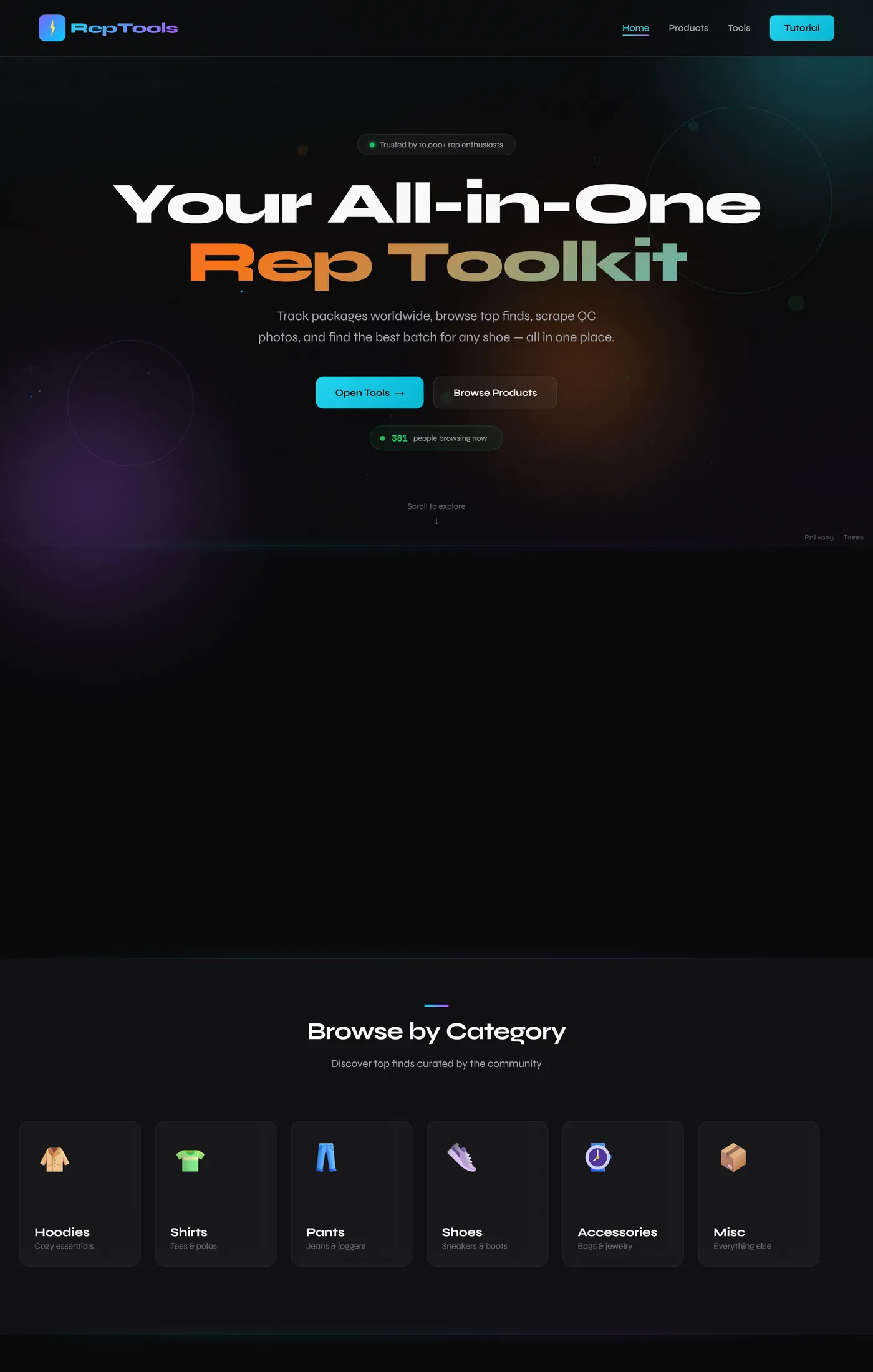
Before: a marketing landing page. The 6,900-item catalogue is not on it.
02

Tactical, not corporate.

The audience is people who buy replica fashion through Chinese shopping agents: they trade QC photos, compare batches, track parcels across 3,100 carriers. That is logistics culture crossed with streetwear drop culture, and none of it looks like a SaaS dashboard.

They also arrive already fluent. The founder runs a TikTok channel about reps with 300k+ followers and over 200 million views, so most visitors land here from that, knowing what QC, batches, agents and hauls mean. Nobody needs the vocabulary explained, which frees the interface to speak plainly in it instead of onboarding people into it.

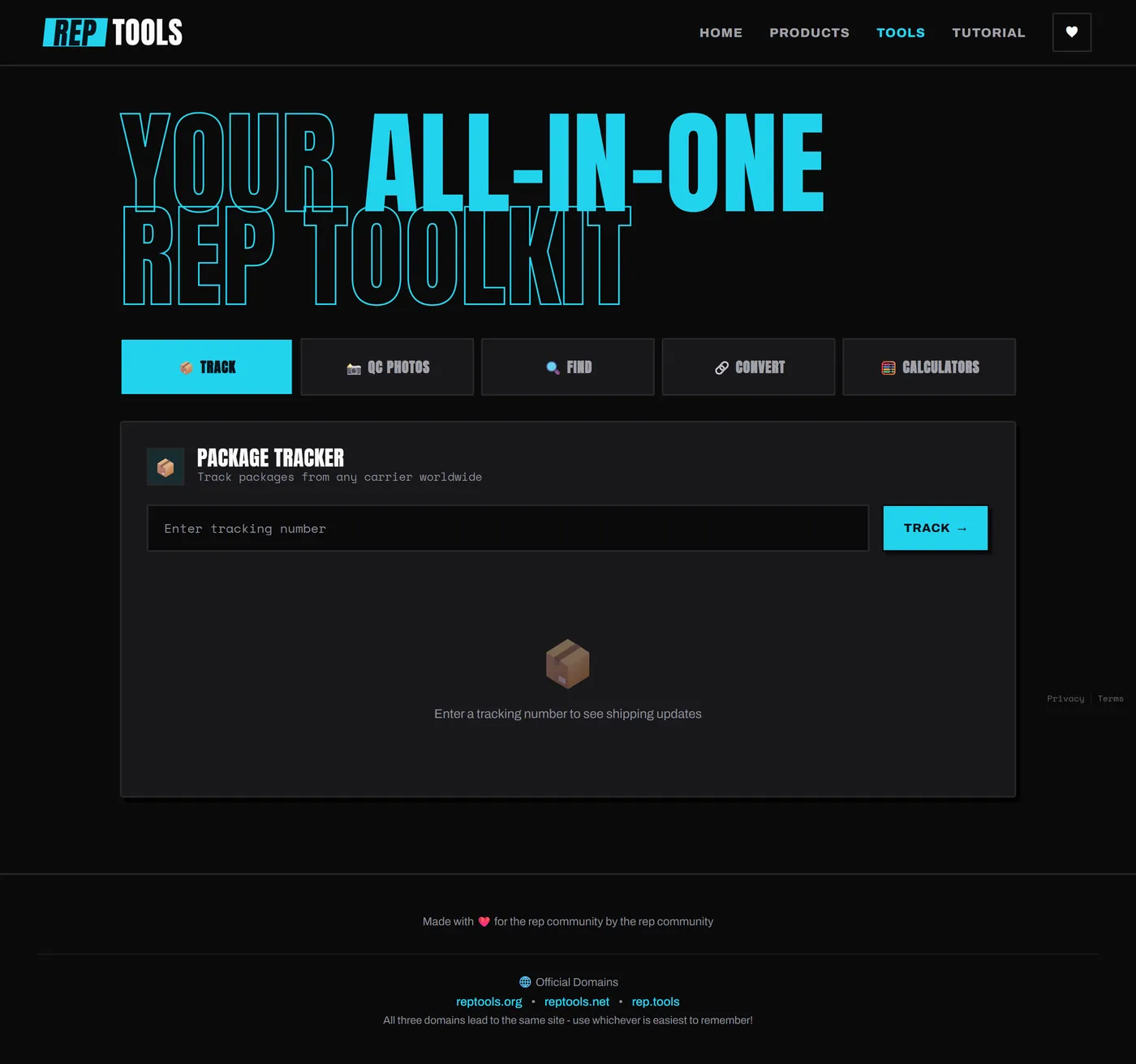
So the identity leans into the subject rather than away from it. Anton in oversized condensed caps for headlines, electric cyan on near-black, Space Mono reserved for anything that behaves like data (prices, batch names, tracking numbers, counts). Hard edges instead of soft pills. A QC PASSED stamp in the hero, because a QC pass is the moment this community actually cares about.

After: the same page rebuilt around the product, with the identity carrying the logistics language.
03

A storefront, not a pitch.

The homepage was rebuilt product-forward. Instead of six tiles that lead somewhere else, you land in the catalogue itself: category rows you can scroll immediately (shoes, hoodies, jackets, pants, shirts, accessories, sets, shorts), with filter chips at the top for jumping straight to one.

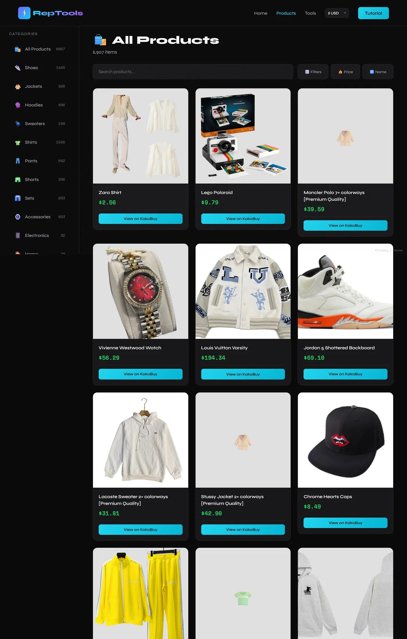
The catalogue itself got the same treatment. Categories moved from a left sidebar into a top bar that carries live counts (6,907 items, 1,545 shirts, 1,445 shoes), so the size of the thing is legible before you click anything. The grid went from three columns to five, and gained the controls a catalogue that size actually needs: search, a price range, sort, currency, reset, and a favourite toggle per item.

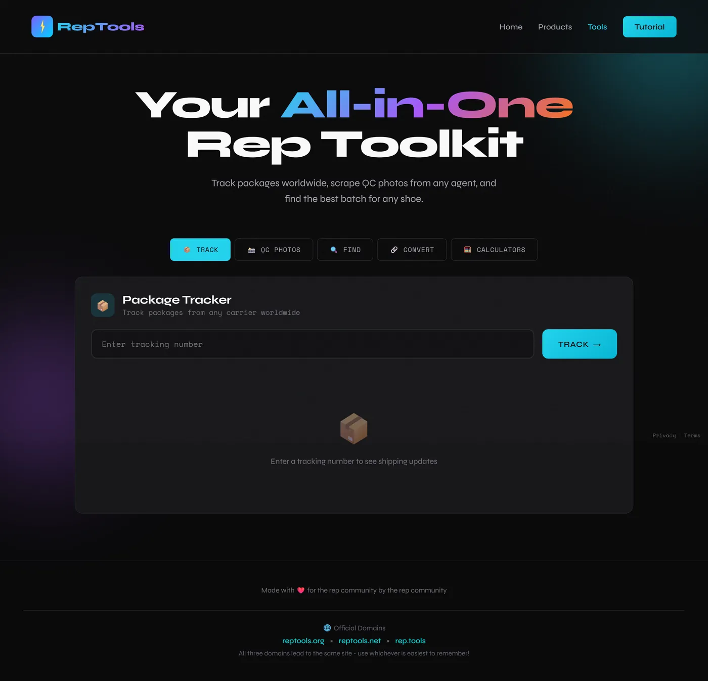
Individual product pages did not exist before, so I added them, giving each item somewhere to live. The five tools were consolidated into a single tabbed surface: track, QC photos, convert, calculators, find, so the utilities read as one toolkit rather than five separate features competing on a page.

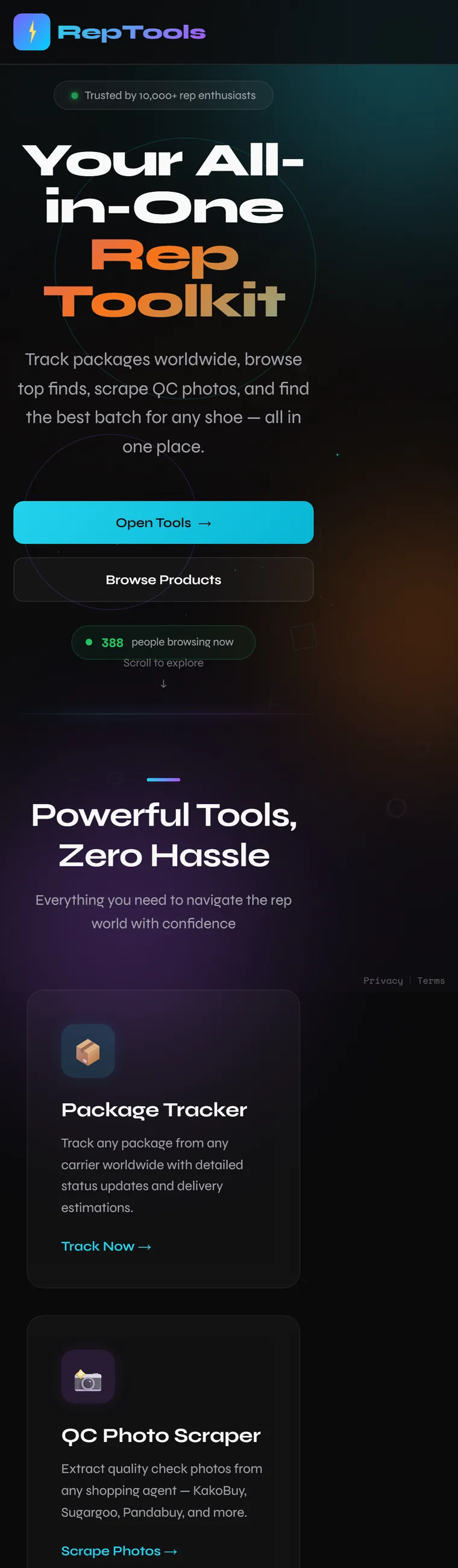
One more thing shaped every call here: almost everyone arrives on a phone, straight from a video. Mobile is the primary surface, not a fallback, so the category rows scroll horizontally by thumb, the filter chips wrap instead of collapsing into a menu, and the counted category bar stays visible rather than hiding behind a hamburger.

Before, on a phone: a hero and category tiles, with the catalogue still a tap away After, on a phone: the catalogue itself, browsable immediately
On the phone, where nearly all the traffic lands: a page that pitches becomes a page you can shop.
Before: sidebar categories, a three-column grid and pagination After: categories as a counted top bar, a five-column grid, and search, price, sort and currency controls
The catalogue, before and after: sidebar and a paginated 3-up grid become a counted category bar, a denser grid, and controls built for 6,907 items.
04

One system instead of a stylesheet per page.

Before the redesign, every template carried its own styles inline, so a colour or type change meant editing each page and hoping they stayed in sync.

I moved the identity into a single shared stylesheet and pulled the navigation and footer into partials, so the surface is defined once and every page inherits it. 38 files changed; the homepage alone was a near-total rewrite. That is what makes the tools, the catalogue, the tutorial and the error pages feel like the same product. The work was scoped to the front end: the founder built and owns the app, and I redesigned what it looks like and how it is organized.

The tools surface, before and after: five features on a page become one tabbed toolkit. The tools surface, before and after: five features on a page become one tabbed toolkit.
The tools surface, before and after: five features on a page become one tabbed toolkit.
05

Live, and being used.

rep.tools is live, and the redesign is what visitors land on today. It is not discovered cold either: the founder's channel sends a steady, already-invested audience straight at it, which is exactly the case where a homepage that only pitches is a wasted screen.

The lesson I keep from it: the original design was not bad work, it was work that had been outgrown. The site was still shaped like the day it launched while the product underneath had turned into something else. Most of the job was noticing that gap, then making the interface behave like what the thing had actually become.

Next project

Driftwood

An AI ethics game: adopt a pet, discover its flaw, train it to be better. Designed and built solo.